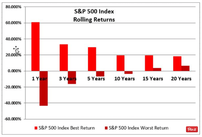
The picture below will help you understand long-term investing more than anything else you’ll lay your eyes on.
It shows the best and worst of the S&P 500 (aka the “stock market”) from January 1973 to December 2016… based on rolling returns.
What’s a rolling return? It’s easiest to explain through example.
The 5-year rolling returns from 1973 to 2016 include 5 years from :
1973 – 1977
1974 – 1978
1975 – 1979…..rinse and repeat until…
2012 – 2016
Pretty simple, right?
So the graph below shows the best 5 years and the worst 5 years. And then does the same for 1, 3, 10, 15 & 20 year rolling returns.
(For the nerds – it’s actually broken down by month – as in 1/1973 – 12/1973, then 2/1973 – 1/1974, etc.)
And these are ANNUAL returns. For example, during the best 15 year period, you made 20% every single year. Not just 20% over 20 years.
Why is this the most important graph you’ll ever see? Because the WORST 15 year return was a positive 6.5% annual return.
Patience and long-term investing rewards you with more money.